Entry #7: HTML tag references
There are a lot of different tags used in HTML code. Some tags are hard to remember but w3schools has made a reference list of all of these tags and their jobs.
This reference list can be found here: http://www.w3schools.com/tags/default.asp
There are also many more css properties and w3schools also has a reference page for these: http://www.w3schools.com/cssref/default.asp
The css properties are organized in property groups and can be easily found by clicking on the links at the top of the page.

Entry #6: How to add a search Bar

The search bar will allow people who visit your website to search throughout your website.
1. The code below is typed in the html document
 <!DOCTYPE html>
<html>
<head>
<title>Search Box Example 1</title>
<meta name="ROBOTS" content="NOINDEX, NOFOLLOW" />
</head>
<body>
	<!-- HTML for SEARCH BAR -->
	<div id="tfheader">
		<form id="tfnewsearch" method="get" action="http://www.google.com">
		        <input type="text" class="tftextinput" name="q" size="21" maxlength="120"><input type="submit" value="search" class="tfbutton">
		</form>
	<div class="tfclear"></div>
	</div>
</body>
</html>

2. Then the css is typed into the css document
	#tfheader{
		background-color:#c3dfef;
	}
	#tfnewsearch{
		float:right;
		padding:20px;
	}
	.tftextinput{
		margin: 0;
		padding: 5px 15px;
		font-family: Arial, Helvetica, sans-serif;
		font-size:14px;
		border:1px solid #0076a3; border-right:0px;
		border-top-left-radius: 5px 5px;
		border-bottom-left-radius: 5px 5px;
	}
	.tfbutton {
		margin: 0;
		padding: 5px 15px;
		font-family: Arial, Helvetica, sans-serif;
		font-size:14px;
		outline: none;
		cursor: pointer;
		text-align: center;
		text-decoration: none;
		color: #ffffff;
		border: solid 1px #0076a3; border-right:0px;
		background: #0095cd;
		background: -webkit-gradient(linear, left top, left bottom, from(#00adee), to(#0078a5));
		background: -moz-linear-gradient(top,  #00adee,  #0078a5);
		border-top-right-radius: 5px 5px;
		border-bottom-right-radius: 5px 5px;
	}
	.tfbutton:hover {
		text-decoration: none;
		background: #007ead;
		background: -webkit-gradient(linear, left top, left bottom, from(#0095cc), to(#00678e));
		background: -moz-linear-gradient(top,  #0095cc,  #00678e);
	}
	/* Fixes submit button height problem in Firefox */
	.tfbutton::-moz-focus-inner {
	  border: 0;
	}
	.tfclear{
		clear:both;
	}
</style>

For more information and how to add a text placeholder in the search bar the link is here: http://www.textfixer.com/tutorials/html-search-box.php
Entry #5: Using Bootstrap
Bootstrap is a site that has pre made designs and coding for anything you need to make a basic site.
To use bootstrap you go to this site: http://getbootstrap.com/ and follow these steps to get started.
1. click the get started tab at the top of the page.
You can either download bootstrap and all the css or you can copy and paste the code directly into your code. Downloading the code prevents it from somehow loosing the code you have.
2. After you download the code you can start customizing your own page.
Click components at the top of the page and use the navigation on the right hand side to find a design you want. Copy the code given underneath it and paste it in your html code.
3. Lastly you have to fix the code and play around with the pre made settings to make the site your own. Changing example text to what fits your site is a good place to start then you can change color and small details.
4. Choose more components to put on your site and continue the process.
Practice homepage I made with bootstrap:


Entry #4: How to make shapes using CSS
Circle
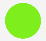
To make a circle like this one we need to have a div
1. make a div called circle (<div id="circle">)
Then we need to make the div has an equal width and height
2. choose any width and height
To make the div a circle shape you need to add a border radius
3. Make the border radius half of the width and height you made the div
4. Add a background color
The css should be set up and look similar to this:
#circle
{
width: 120px;
height: 120px;
background: #7fee1d;
border-radius: 60px;
}
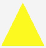
To make a square just delete the border radius and the shape will become a square. To make a rectangle just change one of the side lengths. To make a triangle follow this css:
#triangle
{
width: 0;
height: 0;
border-bottom: 140px solid #fcf921;
border-left: 70px solid transparent;
border-right: 70px solid transparent;
}
To make the triangle face down change border-bottom to border-top.

For more shapes and information visit this site: http://www.1stwebdesigner.com/create-different-shapes-css/
Entry #3: How to change the color of an object in Photoshop
To change the color of an object in a photo like a flower in photoshop follow these steps:
1. Open the photo you want to edit in photoshop
2. Use the quick selection tool to select the object you want to edit
3. Click Image --> Adjustments --> Hue/saturation and change the sliders until you get the color you want
4. Click Image --> Adjustments --> color balance and change the sliders to edit the color more
For more information on how to change the color of an object in photoshop watch this video: https://www.youtube.com/watch?v=ZVIpwxlhd0A
This was the photo I changed the color of an object in:


Entry #2: Image Opacity
Image opacity is the transparency of an image.

1. To make an image transparent follow this CSS code:
img {
opacity: 0.4;
filter: alpha(opacity=40);/* For IE8 and earlier */
}
If you want to adjust the amount of transparency all you have to do it change 0.4 to a lower number for more transparency and a higher number for a more clear image.
Before hover While image is hovered over

2. To make an image appear transparent until it it hovered over you would use this CSS:
img {
opacity: 0.4;
filter: alpha(opacity=40); /* For IE8 and earlier */
}
img:hover {
opacity: 1.0;
filter: alpha(opacity=100); /* For IE8 and earlier */
}

3. To make a transparent text box over a clear box on an image (like in the image above) use this CSS:
<html>
<head>
<style>
div.background {
background: url(klematis.jpg) repeat;
border: 2px solid black;
}
div.transbox {
margin: 30px;
background-color: #ffffff;
border: 1px solid black;
opacity: 0.6;
filter: alpha(opacity=60); /* For IE8 and earlier */
}
div.transbox p {
margin: 5%;
font-weight: bold;
color: #000000;
}
</style>
</head>
<body>
<divclass="background">
<divclass="transbox">
<p>This is some text that is placed in the transparent box.</p>
</div>
</div>
</body>
</html>
More information: http://www.w3schools.com/css/css_image_transparency.asp
Entry #1: Fading text
How do you make text fade in on a website?
When you arrive on the page the text will automatically fade in, to see it again you must reload the page.
The html and css to make text fade in on a website looks like this:
<!DOCTYPE html><html>
<head>
<meta content="en-us" http-equiv="Content-Language">
<meta charset="utf-8">
<meta content="stuff, to, help, search, engines, not" name="keywords">
<meta content="What this page is about." name="description">
<meta content="Example Of Many Things" name="title">
<title>Example Of Many Things!</title><style type="text/css">body { background-color: #F5F5F5; margin: 50px;
margin: 25px 0 0 0;
}#main { text-align: center; background-color: #82C1FF; width: 600px; height: 300px;
margin: 0 auto;
border-radius: 5px;}
h1 {
font-size: 88px; font-family: Arial, Helvetica, sans-serif; font-weight: normal; color: #FFF; margin: 0;
padding: 90px 0 25px 0;
transform-origin: 50% 100%;
text-shadow: 2px 2px 2px #333;
animation-duration: .3s; animation-name: fadeAndScale; animation-timing-function: cubic-bezier(.71,.55,.62,1.57);}a { font-family: Cambria, Cochin, serif; font-size: 16px; color: #333; padding: 5px; border-radius: 5px; background-color: #A6D2FF;
transition: background-color .2s ease-out;
}a:hover { background-color: #EEE;}@keyframes fadeAndScale { from { opacity: 0; transform: scale(.9, .9); }
to {
opacity: 1; transform: scale(1, 1); }}</style></head>
<body>
<div id="main">
<h1>hi, everybody!</h1>
<p><a href="#" onclick="window.location.reload(true);return false;">reload</a></p>
</div>
<script src="http://www.kirupa.com/prefixfree.min.js"></script>
</body></html>
For more information on this animation and an example visit this site: http://www.kirupa.com/html5/simple_text_fade_and_scale_animation.htm
Comments (5)
Lori said
at 12:14 pm on Feb 24, 2015
Entry #1, 4/4. Very interesting topic which I have never seen before. I am interested in trying out this code. Please be sure to add an image to help visually understand the outcome of your code.
Lori said
at 8:23 am on Mar 17, 2015
Entry #2: 4/4. Great job, I like how you provided the directions on how to complete this action using CSS rather than Photoshop. Very useful post.
Lori said
at 8:32 am on Mar 31, 2015
Entry #3: 4/4. All required elements are provided. Simple post but needed at times.
Lori said
at 8:57 am on Apr 9, 2015
Entry #4: 4/4. All required elements are provided. This is a very useful post and I like how you incorporated CSS3 into your post, very up to date!
Lori said
at 8:07 am on May 20, 2015
Entry #5: 4/4
Entry #6: 4/4
Both of these are very useful and Adv. 1 level entries. I really like the bootstrap post and make sure the search bar code actually works (they can be tricky sometimes)
You don't have permission to comment on this page.